Nobody should wait on hold. Giga picks up right away and resolves the issue on the first call.
These guidelines cover the logo, typography, color, and imagery for everything that carries the Giga name.
Logo
An emblem and a wordmark
Use the full lockup to introduce the brand, black on light grounds and white on dark. The emblem alone suits compact spaces and familiar contexts.
Type
Statements in Geist Pixel Line
Everything else is Geist, and labels are Geist Mono. Point at a card to set its face, and pick what the stage shows.
Aa
A
Geist, Geist Mono, and Geist Pixel are made by Vercel and free to use under the SIL Open Font License 1.1. Get the fonts
Color
Black and white, orange for action
Orange marks the one thing to do on a screen, so it stays small.
Brand
Product
Studio
Burned into titanium
Every Giga background is the same light at a different moment. Pick one, size it, export it.

Moment
Motion
Format
Headline
Imagery
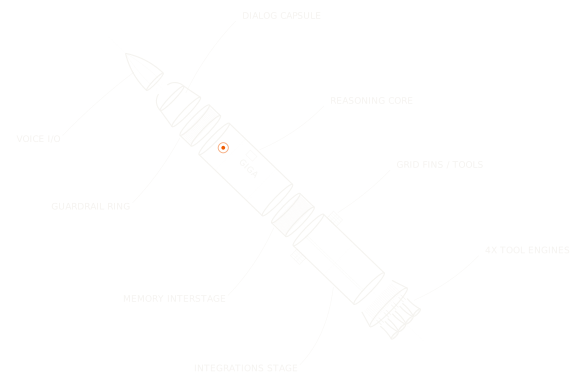
Drawn in fine line
Fine line illustration carries the brand, drawn from the product’s own machines.

Giga Records
Music from our films
Every track scored a Giga film or launch. Take a record off the shelf to play it.
GR 001Stopped
Track 01
0:000:48
One book for each of our engineers, thickened by every pull request they’ve opened.
For AI tools
The brand as one file
Add it to Claude Design or any AI design tool, and what it makes starts on brand.
# Giga brand guidelines

Use this file when you make anything for Giga: a page, a one-pager, a deck, a social post, or a print piece. Giga builds enterprise AI agents for customer support that resolve complex conversations across chat, voice, and email.

## What the brand stands for

No time to wait. People expect answers in seconds, and nobody should wait on hold: Giga picks up right away and resolves the issue on the first call. Anything with the Giga name on it should feel like that call: quick and sure.

## Voice

Giga speaks with clarity, structure, and calm intent. Aim for a tone that is clear, composed, and curious, for builders, operators, and enterprise teams.

- Calmly capable. Even at scale, we stay grounded. Structured, measured, and in control.
- Intelligently precise. Each word is selected to inform, guide, and simplify. No filler. No noise.
- Systematically curious. We explore with purpose. Every question leads to better systems.
- Plain, short sentences. Say what the product does.
- No em dashes. Use a period, comma, or colon.
- Oxford comma in lists of three or more.

## Typography

| Role | Typeface | Use |
| --- | --- | --- |
| Statement | Geist Pixel Line, 400 only | H1 and H2 headlines, big statements. H1 44 to 76 px at leading 0.9 to 1, H2 32 to 56 px at leading 1.1 |
| Heading | Geist, 500 | H3 to H6 and section heads, 16 to 24 px at leading 1.3 |
| Body and UI | Geist, 400 | Running text, buttons, UI labels, 15 to 16 px at leading 1.55. A lead paragraph can run to 19 px |
| Label | Geist Mono, 400 | Eyebrows, labels, and annotations: 11 px, 24 px line height, uppercase, tracking 0 |

- Tracking is -3% on headings and 0 everywhere else, statements included.
- Giga does not use a serif.
- Geist, Geist Mono, and Geist Pixel are by Vercel, under the SIL Open Font License 1.1. Get them at https://vercel.com/font.

## Color

Brand colors say Giga. Product accents mark a state inside the product.

### Brand colors

| Name | Value | Use |
| --- | --- | --- |
| Ink | #0A0A0A | Logo, text, and buttons on light |
| White | #FFFFFF | Light pages |
| Soft white | #EEECE6 | Text on dark grounds |
| Ground | #0F0D0D | Dark pages, and where every gradient fades |
| Brand orange | #EF5A00 | Primary action and hover. One use per view. |

### Product accents

| Name | Value | Use |
| --- | --- | --- |
| Success | #008573 | A good outcome: resolved, passed, improving |
| Warning | #FFBA18 | Needs attention soon |
| Error | #D13415 | A failure, or an action that can't be undone |
| Info | #0D74CE | Neutral information |
| Feature | #654DC4 | Something new |

- Product accents belong to the product's screens: the console, Scout, and a product screen shown on a page. Each one means a state, so never use one to decorate a page, a slide, or a background.
- Brand orange is never a state, and a product accent is never the action.

## Logo

- Use the full lockup when introducing the brand or in broad public settings. The emblem alone is suitable for compact spaces or familiar contexts: avatars, app icons, favicons, clothing.
- Black on light grounds, white on dark. Always preserve contrast and spacing to ensure clarity and recognition.
- Do not redraw the logo.
- Do not rotate the logo.
- Do not add a gradient.
- Do not stretch the logo.
- Do not use two colors.
- Do not outline the logo.
- Do not add depth or 3D.

## Shape

- Buttons, keys, and fields: 8 px corner radius.
- Images inside cards: 6 px radius.
- UI placed over imagery is frosted glass: a translucent fill with a background blur, never an opaque panel.

## Elements

- Photography. High contrast, direct light to illuminate the focus, and annotations to highlight how we understand and act in the physical world.
- Technical illustration. Fine line illustration gives a sense of technical precision and futuristic technology.
- Line. Horizontal lines bring to mind linear motion, an old intercom speaker grille, and a direct path from problem to resolution.
- Gradient. Light leak gradients that communicate a spatial field, add visual interest, and imply emotion.

## Background patterns

Every Giga background is the same light, burned into titanium, at a different moment. There are six: Home, Gold, Platform, Build, Observe, and Improve. Make one on giga.ai/design: pick the moment, the motion (still, drift, flow, or surge), and the size, then export an image or an 8 second video.

- Use one pattern per piece, full bleed, behind the content.
- Set text and the logo in white or ink, whichever reads better on the light under them.

## Imagery

Three kinds of picture carry the brand: technical illustration, photography, and the product's own screens.

### Illustration

- Fine line, one hairline weight, in soft white on dark or ink on light.
- Draw real things: the product's machine, a mechanism taken apart, a part list.
- Label the parts in Geist Mono, uppercase, on a fine leader line.
- Brand orange marks one point at most.

### Photography

Our photography focuses on people and the story of their experience with our product, focusing on the human emotion.

- Tell a story. Show people using the product in some way: our Console or Scout, or talking to a support agent.
- Direct light. Direct, high contrast Rembrandt lighting (quarter key and edge) on the most operative part of the image: the person's face, hands, or device, whatever tells the story. Sunlight or studio light.
- Minimal backgrounds. Nothing that gets in the way of the human story.
- Tight crops. Bring the viewer into the scene and focus the image on the details.
- Do not show a direct gaze into the camera, stiff or formal posing, excessive expression, black and white, gobos, glamour styling, wide and busy scenes, silhouettes, uniformly bright corporate or stock looks, light that is too dramatic and contrasty, or happy groups who are not using a support agent or doing work.
- When product UI appears, use the real product screens.

Industry pages and tailored pages show the places and machines of the industry they speak to.

- One subject, from above or close in, graphic, with room around it. Editorial, never literal stock.
- No logo, livery, readable brand name, or recognizable face.

### Product UI

Faux UI is the real product, drawn for a page: the console, a ticket, Scout, and the CLI.

- Show what the product does today, with real states and plausible data. Never placeholder text, and never a feature the product doesn't have.
- A product screen keeps its product accents on a solid panel ground. Everything around it stays in the brand colors.
- Keep the screen at a real window's proportions. Don't scale its type up to fill a column.

### Annotation

We layer technical illustration on top of the image to communicate the intelligence layer our product adds.

- A fine hairline runs from one detail (a face, a hand, a device) to a label in Geist Mono, uppercase, such as "SENTIMENT: SATISFIED".
- The label says what Giga reads or does at that moment.
Press
Press assets
Covers from what we have shipped, free to run with a story about Giga. Use them as they are. The kit also holds the logo, the brand file, the colors, the backgrounds, and the imagery.